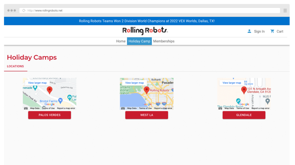
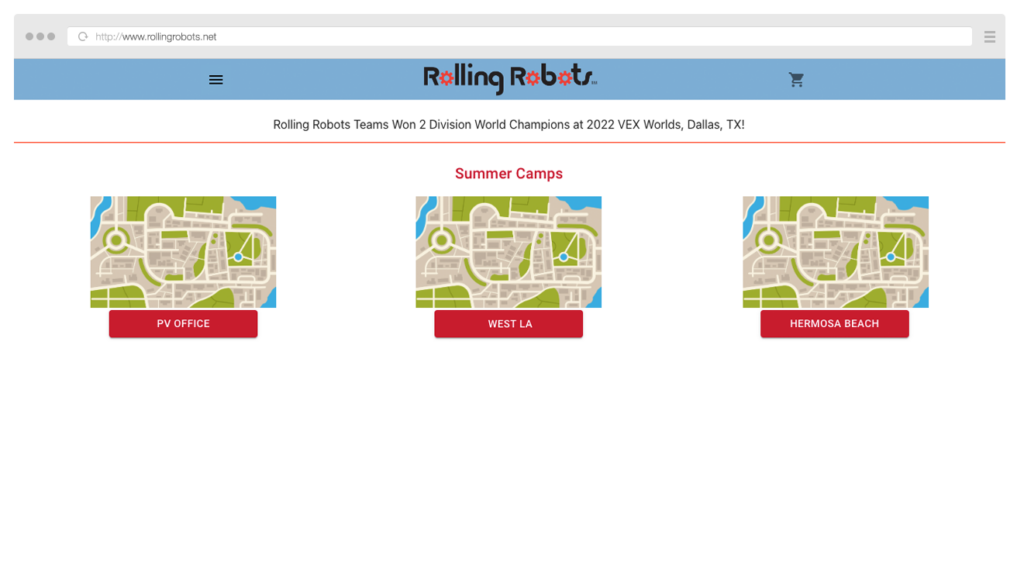
One of my main responsibilities was to refresh the website’s design to improve it’s user friendliness while also better reflecting the company’s brand.
Before
Initial website design
After
Updated website design

Navigation
As the website’s features expanded, the navigation system became more confusing and maze-like. To streamline the navigation experience, I pitched and developed the concept of having two main navigation bars:

Primary Navigation – Controls the main site features: Page navigation, login, and cart
Secondary Navigation – Controls a specific page’s features: varies depending on the page
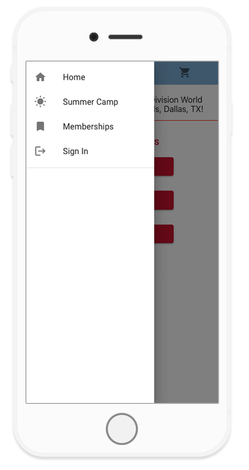
Before
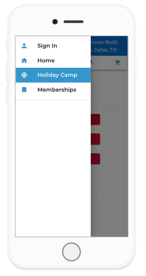
After
On mobile, the primary navigation bar takes the form of a side drawer.
The user’s current location is highlighted, to help prevent them from getting lost.
Design Guide
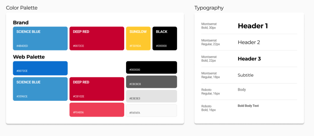
Working off of pre existing branding material, I created a basic design guide. With these fundamental building blocks established, myself and other developers are able to quickly build uniform and consistent features.
The color palette and typography guide were designed with the goal of creating the simplest experience for users to access information, without losing the fun of the brand’s aesthetic.
I designed and built reusable card components to further streamline the user experience. I focused on emphasizing the hierarchy of information and sprinkled in some iconography to keep the user experience joyful.
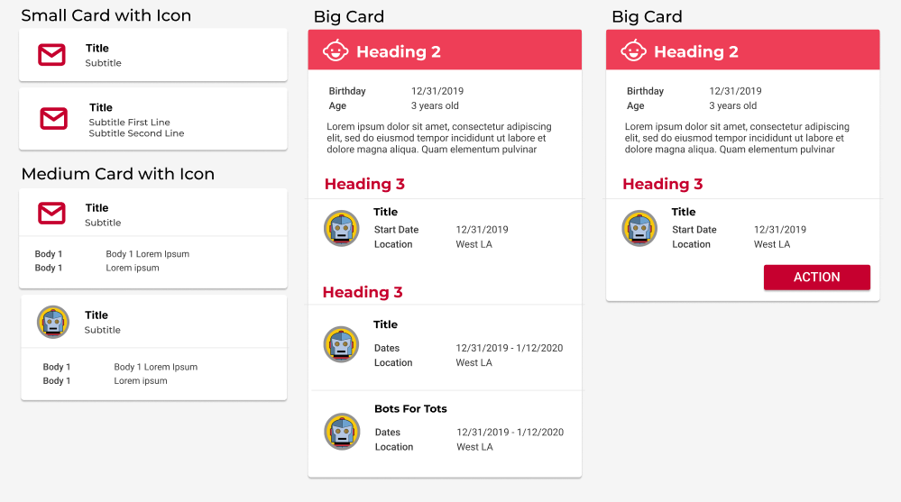
Both these features were integrated into the website using Mui’s Theme Provider to make it convenient for developers
Implementation
The final piece in this design refresh was bringing everything together in the account info page. I wanted this page to serve as a central hub for everything related to a parent’s account so they could get a quick overview of their kids and orders, then easily navigate to the catalogs.

Before
Initial website design
After
Updated website design
